

Simplest Snap Card Carousal In SwiftUI


Simplest way to implement snap to an item while scrolling in SwiftUI. We’ll implement this using ZStack.

Snap card carousel effect is a common and essential component in many home screen layouts. It adds a dynamic and engaging user experience. This feature is considered a fundamental requirement for any programming language’s toolkit.
Before getting started, please consider follow using this link, and don’t forgot to give some likes if you found the below blog useful! It will encourage me to write even more often.
Getting Started
Let’s begin by crafting the Card struct. We will incorporate the necessary properties into it. Following this, we will proceed to design our card view, carefully specifying the appropriate width and height for it.
struct Card: Identifiable {
    var id: Int
    var color: Color
}
We will now generate CarouselCardView.swift. This file will encompass properties such as the current card and the current index.
struct CarouselCardView: View {
    let card: Card
    @Binding var currentIndex: Int

    var body: some View {
        return VStack {
            RoundedRectangle(cornerRadius: 15)
                .foregroundColor(card.color)
                .frame(width: 200, height: 400)
        }
        .frame(width: 200, height: 400)
    }
}
Instead of specifying fixed width and height, we can calculate the dimensions dynamically using a GeometryReader. Let’s modify the above code slightly to achieve this dynamic sizing of cards.
struct CarouselCardView: View {
    let card: Card
    @Binding var currentIndex: Int
    let geometry: GeometryProxy

    var body: some View {
        let cardWidth = geometry.size.width * 0.7
        let cardHeight = cardWidth * 1.5
        let offset = (geometry.size.width - cardWidth) / 2

        return VStack {
            RoundedRectangle(cornerRadius: 15)
                .foregroundColor(card.color)
                .frame(width: cardWidth, height: cardHeight)
        }
        .frame(width: cardWidth, height: cardHeight)
    }
}
Create the SnapCarouselView struct
The SnapCarouselView struct will serve the purpose of displaying the card carousel and managing the associated animations. We’re utilizing GeometryReader to obtain the precise parent size for the child elements. For further information on GeometryReader, you can explore more details here.
import SwiftUI

struct SnapCarouselView: View {
    @State private var currentIndex: Int = 0

    let cards: [Card] = [
        Card(id: 0, color: Color.red),
        Card(id: 1, color: Color.green),
        Card(id: 2, color: Color.blue),
        Card(id: 3, color: Color.orange),
        Card(id: 4, color: Color.purple)
    ]

    var body: some View {
        GeometryReader { geometry in
            ZStack {
                ForEach(cards) { card in
                    CarouselCardView(card: card, currentIndex: $currentIndex, geometry: geometry)
                }
            }
        }
        .padding()
        .padding(.top, 132)
    }
}
Preview
Up to this point, your UI preview will resemble the image below:
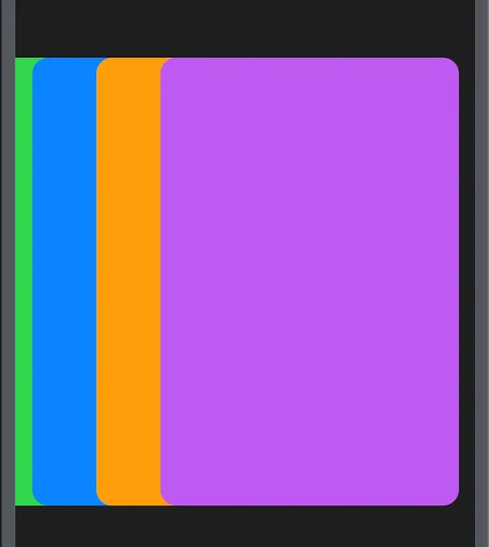
Based on the preview, it’s evident that we need to adjust the X offset of the cards to create separation between them. Additionally, implementing a drag gesture left/right is necessary for sliding the cards. So let’s modify SnapCarouselView class.
In the SnapCarouselView, add the following line just before the closing bracket of the ForEach section in the CardCarouselView.
.offset(x: CGFloat(card.id — currentIndex) * (geometry.size.width * 0.6))
This line will introduce an X offset to each individual card. To achieve the precise separation between cards, you’ll also need to make modifications to the CarouselCardView class. In the CarouselCardView, navigate to the end of the VStack, and insert the following line of code.
.offset(x: CGFloat(card.id — currentIndex) * offset)
The last step involves incorporating a drag gesture and applying animations to facilitate card transitions when swiping left and right.
Let’s revisit the SnapCarouselView
to integrate a dragGesture at the end of the ZStack section. Replace the provided code snippet below.
.gesture(
    DragGesture()
          .onEnded { value in
            let cardWidth = geometry.size.width * 0.3
            let offset = value.translation.width / cardWidth
            withAnimation(Animation.spring()) {
                if value.translation.width < -offset
                {
                    currentIndex = min(currentIndex + 1, cards.count - 1)
                } else if value.translation.width > offset {
                    currentIndex = max(currentIndex - 1, 0)
                }
            }

        }
)
Below is the complete source code for your reference:

I understand that the preview above might not match the thumbnail I presented in this blog post. However, I have an exercise for you to address this. Simply include the rotation3DEffect property in the CarouselCardView within the SnapCarouselView struct. This addition should yield a similar effect. If you’re uncertain and would like to access the code, it’s exclusively accessible on my patron page. For your convenience, here’s the link: Patreon Page
Thanks for reading!